
Madrigal Winery
Brand & Label Design
Madrigal Family Winery proves dreams blossom with enough time, effort, and patience. The Madrigal brand is that of legacy, hard work, and family. The Madrigals moved to Napa in the 1930s, planting forty acres of apples, pears, walnuts, and vineyards halfway between St. Helena and Calistoga, the future motherlode of California wine. Two generations later, Chris continued the growth of the family’s legacy with the establishment of Madrigal Family Winery.


Design Priorities
Madrigal Winery came to Showman Design in 2015 for a full rebrand and repackaging of their wine. The previous brand was outdated and did not speak to the family history within the valley. After learning about 3 generations of farming and caretaking, we built a brand to reflect the growth and establishment of the Madrigal name.
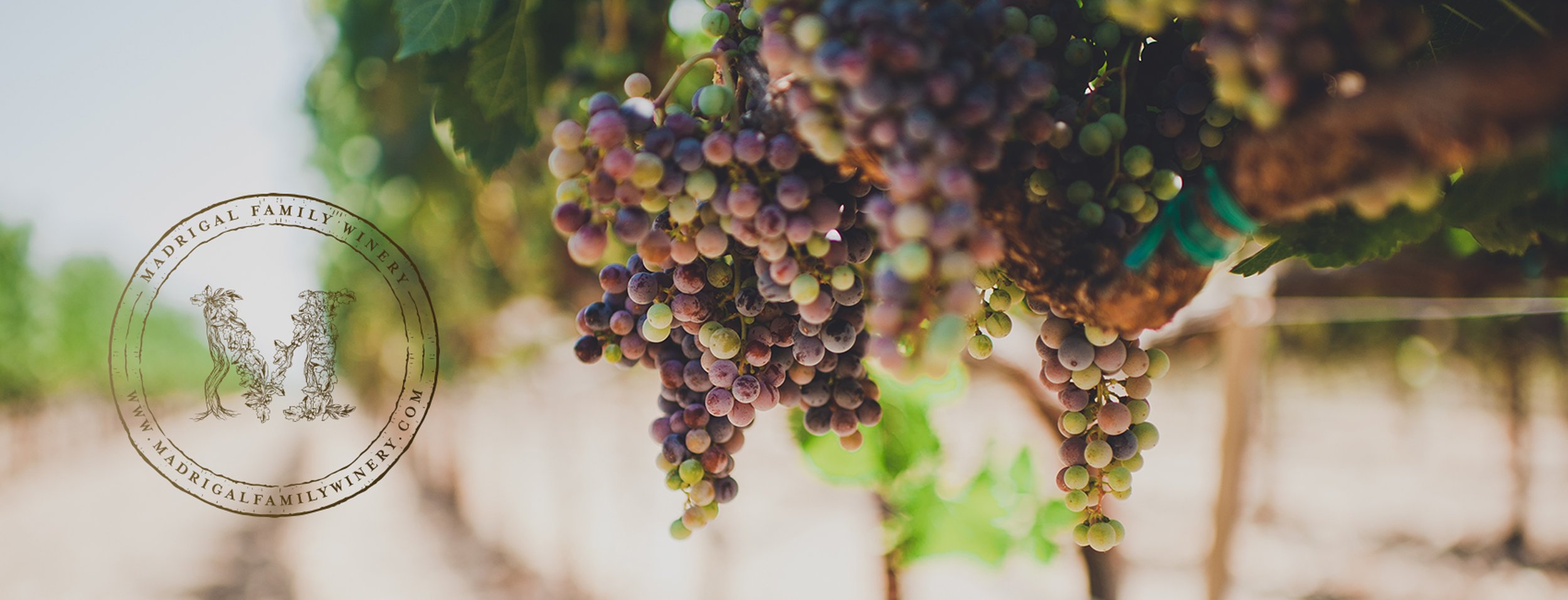
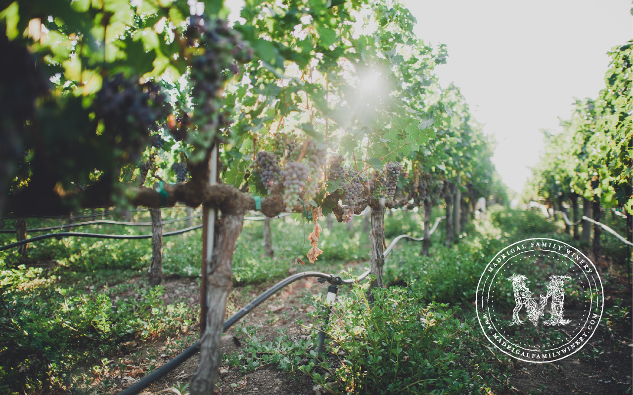
The “M” emblem is a reflection of the caretaking and growth the family has established in the valley. The lifecycle of the wine is reflected in the mark and has a level of sophistication that is matched by the beautiful notes of the wine.
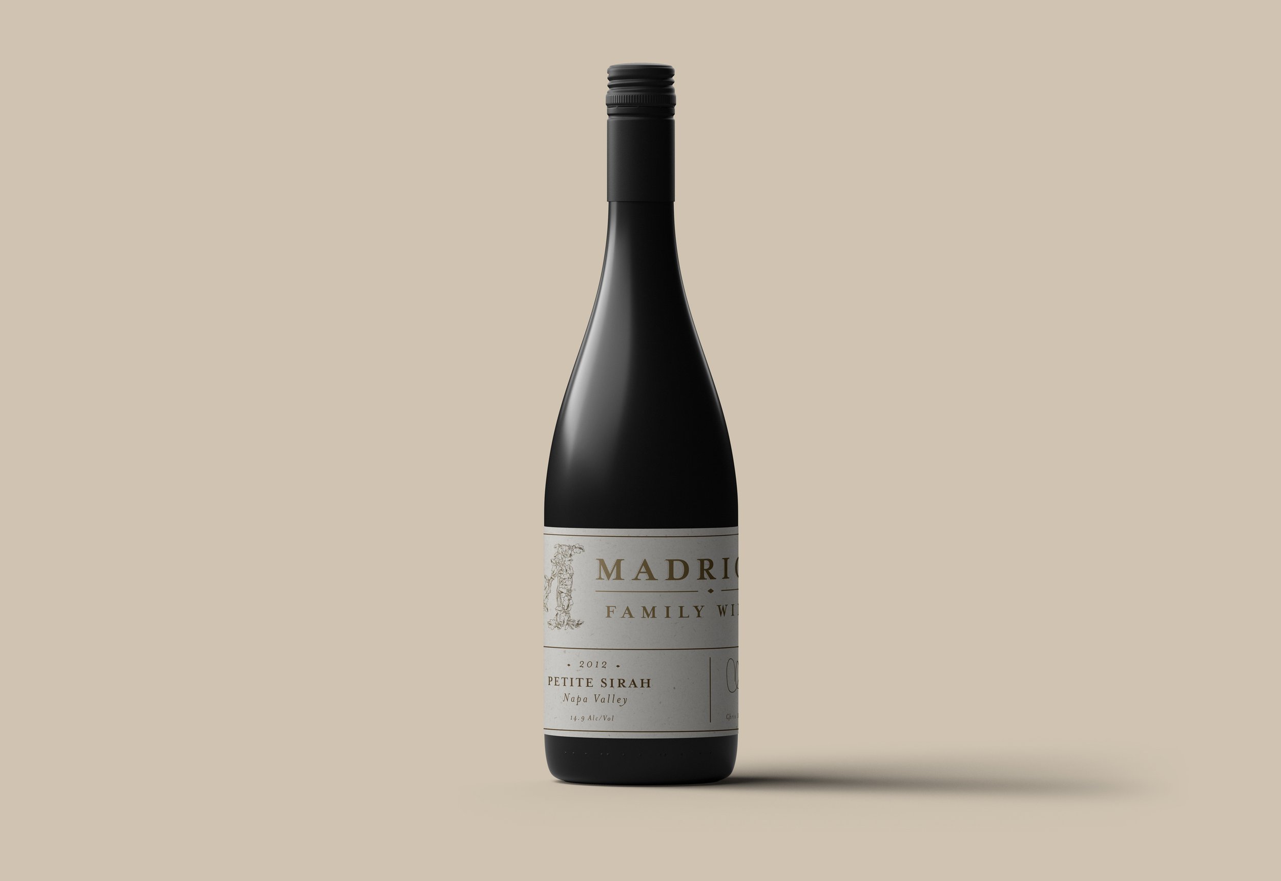
Once the rebrand was established, we designed a label system that was a reflection of the wine profile. Deep colors for the reds and softer monotone colors for the whites.
Team
Brand & Label Design:
Lizzy Ellingson
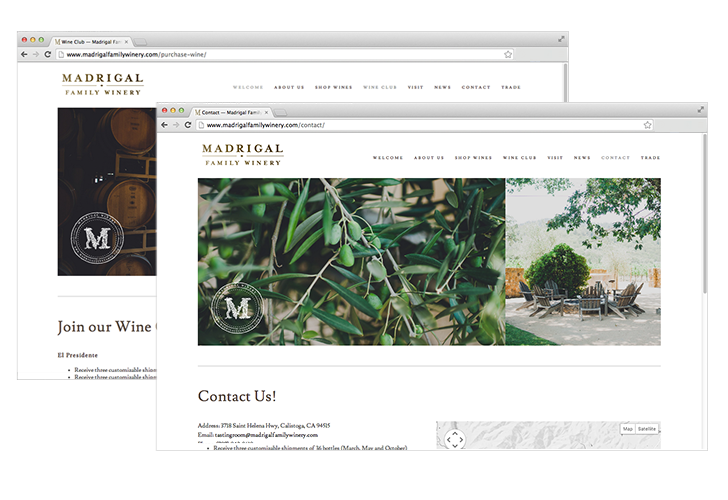
Web Design:
Lizzy Ellingson
Winery Photographs:
Carina Skrobecki
Madrigal Team:
Chris Madrigal, Steve Cousins